Sign-up to our mailing list
Getting Style: The story of Fabulous Beasts’ art design
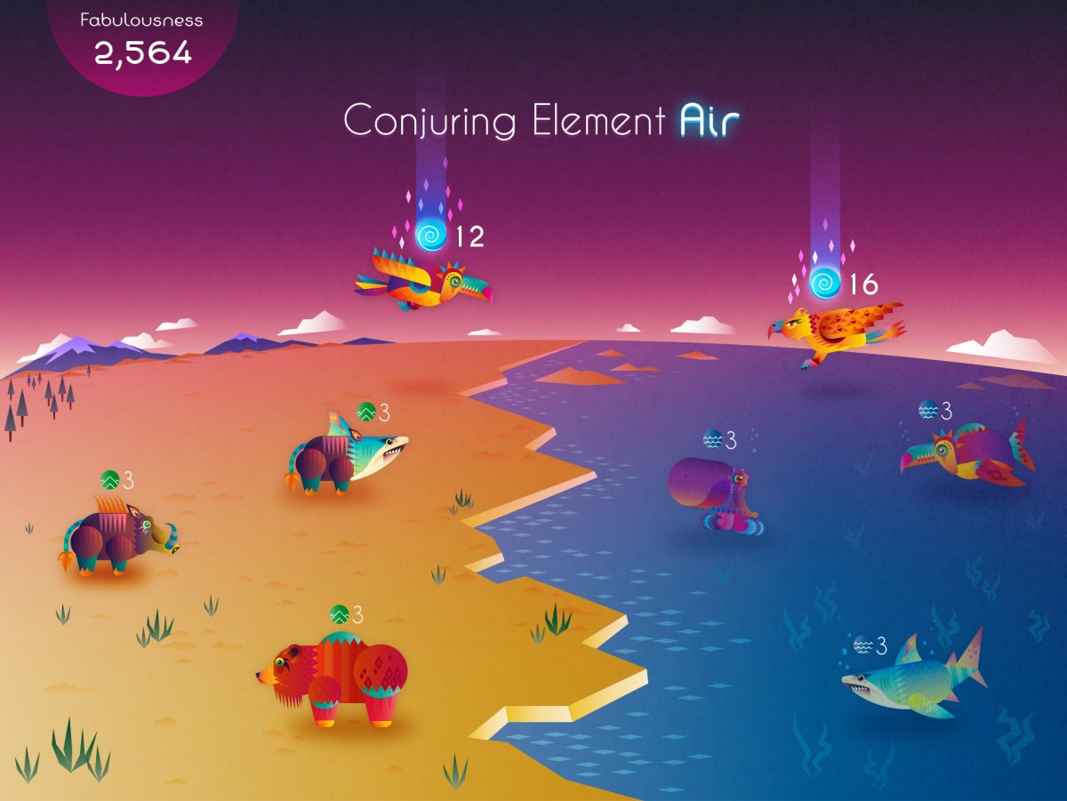
A big part of Fabulous Beasts is the world you see on the connected screen, a world you’re continually evolving as you stack more and more pieces on to your tower. Seeing something you’ve just held in your hand pop into life on the screen is kind of magical, and so is the appearance of bizarre hybrid beasts in the world.
The engineer of all this fabulousness is our artist, Lyall McCarthy. He’s in charge of all the game’s 2D art and user interface design, and has spent the past year or so creating Fabulous Beasts’ style.
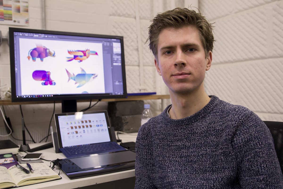
Actually, he’s created three entire Fabulous Beasts styles. As with everything when you’re making something new, Lyall’s journey has twisted and turned. And that’s not all: he’s also developed a system that creates amazing-looking hybrid beasts from lots of different component parts.
And this is where he’s at right now, a view of what you see on your tablet’s screen during play:
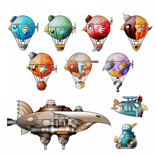
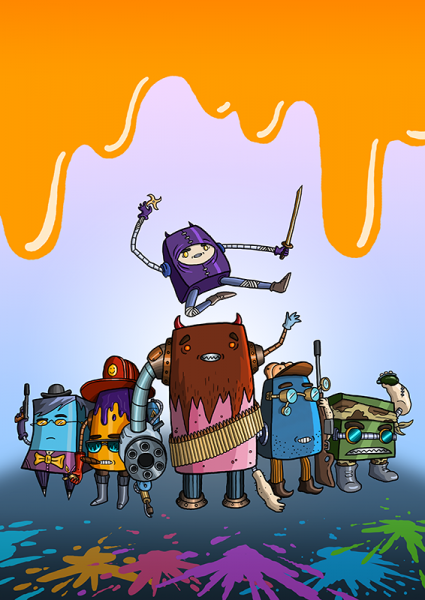
Lyall trained in illustration and he always wanted to be an artist, but when he left university he wasn’t sure what to actually do. He loved games, but concept art for film and TV appealed, too. But the first work experience he found was at London indie studio Beatnik Games. Their artist had just left, leaving a good deal of varied work that Lyall was in a great position to take up. Before he knew it, he was getting paid and found himself working on port of Plain Sight and on character designs for other games. Here’s some of the work he did back then:
Part of that work was designing user interfaces, an area Lyall had never considered before. It soon led him to Hide&Seek, our founder Alex Fleetwood’s company, which was looking for someone to design a website, and there Lyall stayed, working on games like Sesame Street Family Play.
When Alex started Sensible Object, it was almost inevitable that he’d ask Lyall to help create Fabulous Beasts’ style. The original Fabulous Beasts was very different to how it is today, and so was the first style Lyall developed. He wanted to take a very simple iconographic approach, and came up with the idea of origami, liking the image of players being gods breathing life into origami animals.
The style also offered a good way of creating hybrid beasts – the art could be split diagonally in half, creating half elephant, half lions. And it related well to the block designs of the time, which had a low-poly, faceted appearance. Here’s what it looked like:
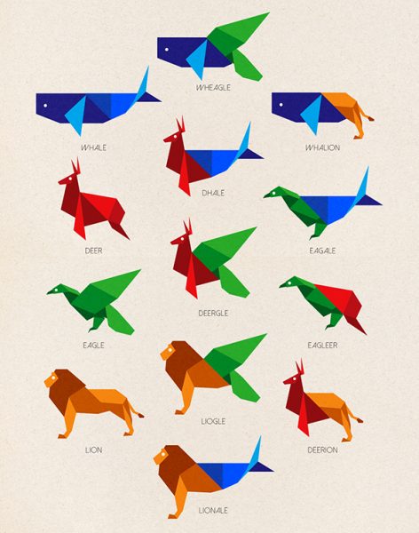
During playtests and at events we took it to like Rezzed, people liked the origami look, but they also wanted the beasts to have a little more character and life to them. A good way of achieving this would be through animation, but the origami and half-and-half approach would make that very hard.
Another problem was that the design of the blocks had begun to change, and the origami look diverged from what you held in your hands. It was time for Lyall to think of a new approach.
With animation now a priority, he began by coming up with ways that beasts could have separate body parts that could be combined together, such as dorsal fins, tails and bodies, all connecting at points, and which could be animated.
While he was tackling this, the rest of the team had made significant developments in Fabulous Beasts’ competitive game, which required a more complex on-screen presentation. The beasts had to be arranged in grids so players could see the territory they held and relationships between them. With some experimentation he came up with an isometric style, where you’re looking down and across at the world, seeing the beasts as 3D, although they were actually 2D art. Here’s what it looked like:
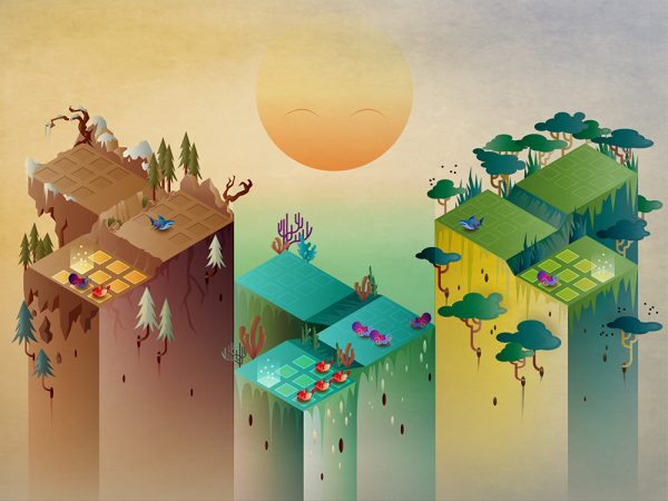
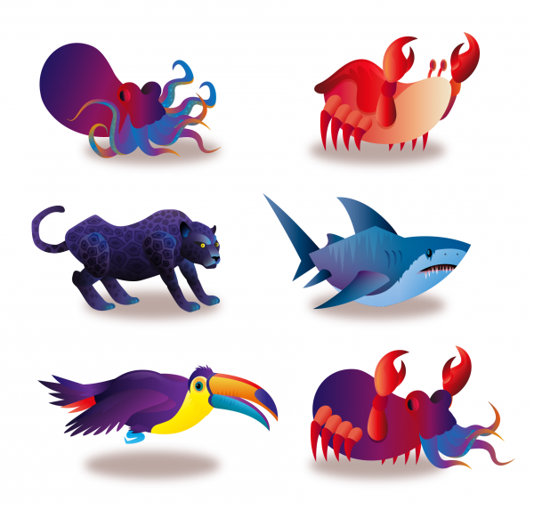
Lyall developed animations for this isometric style, but he never quite loved it. Fortunately, further developments with the game design, which had become cooperative, meant the approach’s days were numbered anyway. The new game design was a lot simpler, allowing Lyall to return to the side-on view.
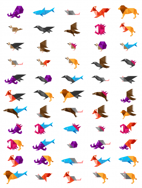
This time, he brought with him the experience of building modular beasts, with parts that could be individually animated to give them movement, and exchanged to make hybrids. It was also a chance to bring the 2D style closer to that of the look and feel of the 3D pieces. And here’s a couple of examples, taken from our DailyFabBeast Twitter account, which generates different hybrid beasts:
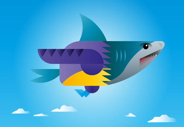
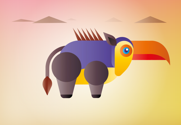
Since then, Lyall has been working to make the beasts more and more visually lavish. We want the beasts to reflect their rising fabulousness as you play, so he’s been making more and more intricate body parts, adding colour, detail and geometric patterns. Here’s a shot of a new beast in motion. Do you feel we’ve narrowed in on the essence of fabulous? We hope so!
Thanks so much for reading. Next time, we’ll tell you about how we, as a small team, are tackling the massive problem of large-scale manufacturing. We have many stories to tell, and experiences to share.
And if you enjoyed this post, we have more about the design and development of Fabulous Beasts:
- How we designed Fabulous Beasts – all about its game design
- Winning the Indiecade Technology Award – how we developed the technology that makes it work
Last thing. We’re taking Fabulous Beasts to Kickstarter on January 26. You should sign up so we can tell you when it starts!
You can also do a lot to help us. We’re a very small team, and we’re super reliant on people like you helping to spread the word. If you have a couple of minutes, maybe tell a friend who’d like Fabulous Beasts all about us. Or maybe more friends. Or maybe all your friends. It would mean the world to us!
And remember that you can always contact us, on Twitter, Facebook or at hello@sensibleobject.com. We would love to hear from you.


